Relative operating characteristic (ROC)
Description of the ROC curve and ROC maps and how they are used to measure the skill of seasonal forecasts.
For more details on ROC please refer to the document and references therein.
Standardised Verification System for long-range forecasts
The ROC curve
Probability forecasts may be used as decision aids. For example, a decision to prepare for a likely seasonal climate event (e.g. warmer-than-usual spring or colder-than-usual winter in a particular region) might be taken (or advised) when the forecast probability of the event exceeds a predetermined 'trigger' threshold.
Different users of the forecast will generally have different sensitivities to events, and would therefore choose different probability thresholds to trigger preparatory action. If preparatory action is advised on the basis of the probability forecast and the anticipated event occurs a 'hit' is scored; if - after action is advised - the event does not materialise, a 'false alarm' is conceded.
For any event a graph can be constructed (know as a ROC curve) that provides information on the hit rates and false alarm rates that can be expected from use of different probability thresholds to trigger advisory action. ROC curves can be used to select the trigger threshold for an event that provides the best trade-off between hit rate and false alarm rate for a particular type of decision.

ROC curves for temperature and precipitation forecasts have been prepared (see Global long-range model probability skill maps) for each geographical forecast region and for each class of event predicted (e.g. tercile or quintile categories).
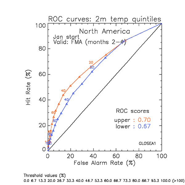
The above figure shows, for illustration, a typical ROC curve. This is a realistic example, but not drawn from any current predictions system. The example illustrates verification of a set of forecasts (here, forecasts over a 16-year period), over a region (here, North America). The sample of forecasts included corresponds to all model grid-points over the region, over the verification period selected.
For the two temperature events (temperature in the upper quintile category, red; temperature in the lower quintile category, blue) the hit rates and false alarm rates associated with a range of 'trigger' thresholds (triangles) are plotted. The vertical axis gives the hit rate, defined as the number of times the event was forecast (with probability above a certain threshold) and later observed to occur.
The hit rate is expressed as a ratio of the total number of occasions on which the event was observed over the whole sample. The horizontal axis shows the corresponding false alarm rate defined as the number of times the event was forecast but did not occur, expressed as a fraction of the total number of times the event did not occur over the whole sample.
From the example it may be seen that a prediction of temperature in the upper quintile category over North America whenever the forecast probability for that event exceeds 40% would, in the long term, result in a 44% hit rate at the expense of a 15% false alarm rate.
A skilful forecast system will achieve hit rates that exceed the false alarm rates and thus the ROC curve will bow to the top left corner of the plot, the more so the more skilful the forecast. A forecast system that has no skill (i.e. the forecasts are no better than guessing) will have hit rates equal to the false alarm rates and the ROC curve will therefore lie along the diagonal.
The ROC score
The geometrical area under the ROC provides a summary statistic for the performance of probability forecasts, and is often referred to as the ROC score. For perfect forecasts, all ensemble members will correctly predict the event in all years and the ROC points will converge to a single point at x=0, y=100, with an area under the curve of 10,000 (usually normalised to 1.0), the maximum possible value. Forecasts with little or no skill will obtain a (normalised) ROC score of approximately 0.5, the area under the diagonal.
ROC maps
By calculating the area under the ROC curve at each model grid-point for the verification period maps depicting the geographical variations in seasonal forecast skill have been prepared for each forecast region and for both temperature and precipitation (see Global long-range model probability skill maps). These values represent average skill over the verification period, estimated from retrospective forecasts (hindcasts).
For details on the hindcast and the reference period used, see information on Seasonal forecast calibration.
Regions with ROC score equal to or greater than 0.7, 0.8 and 0.9 are coloured yellow, orange and red respectively - and indicate regions with relatively good seasonal prediction skill. Regions with ROC score between 0.6 and 0.7 show skill at lower levels but still better than guessing or use of climatology. Grey or light blue shading is used when scores are below 0.6 (i.e. near or below to the 0.5 'no-skill' threshold, suggesting forecasts in these regions are currently little better than guesswork).


